
Introduction
Have you ever wondered about the process of creating a logo? Have you ever wondered how the designer manages to create a brand that meets your needs? In this article, we will explain what the main points to think about are when creating a logo. From the color choice to the logo variations, everything is here to help you understand how a professional goes about this process.
1. Brainstorming
Before starting the design, it is essential to go through a phase of research and reflection: brainstorming.
This is the phase during which you will determine your goals, values and wishes. In order to be as clear as possible, here are the questions to ask yourself.
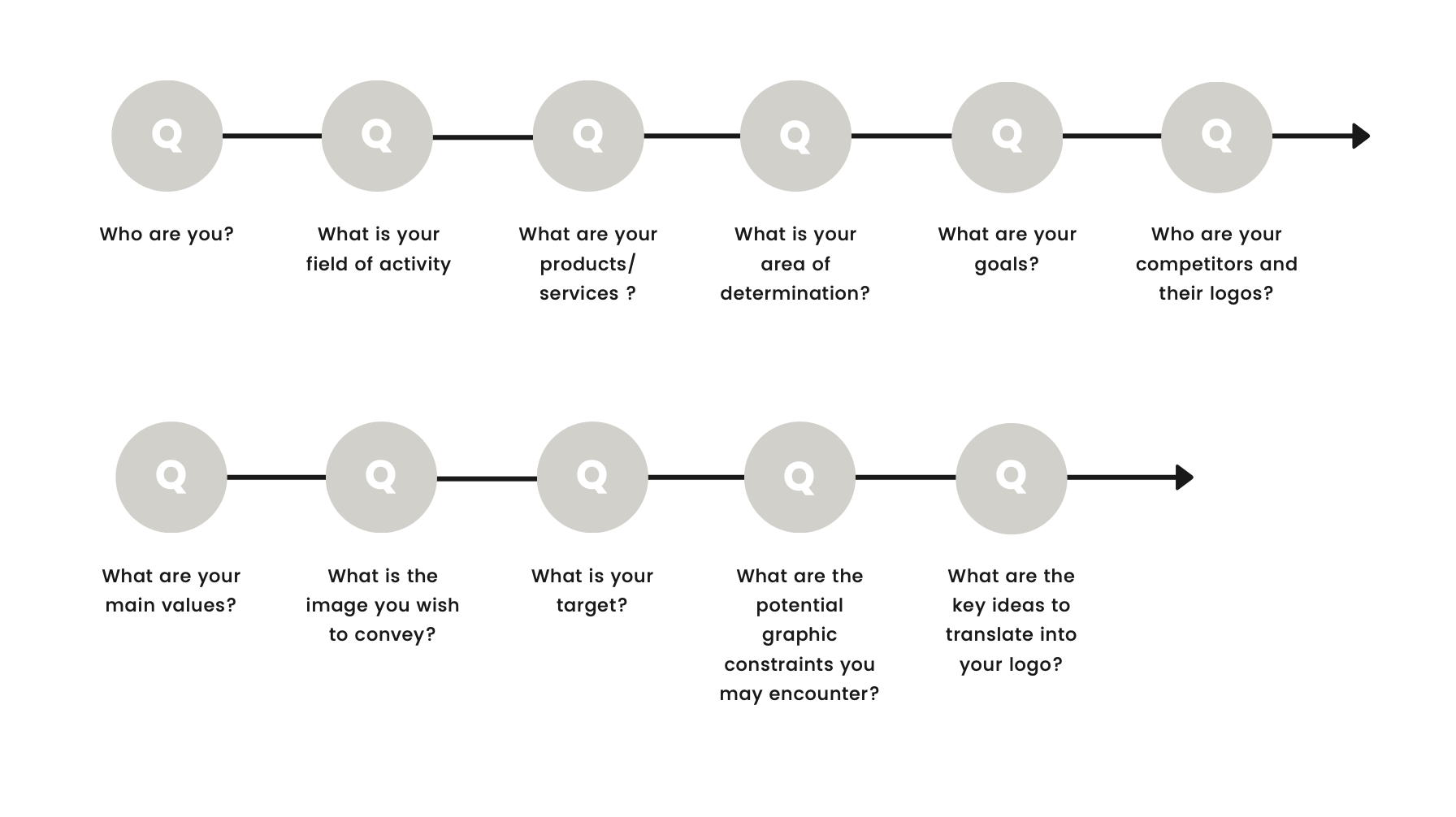
At the end of this questioning, you will have a sufficient framework to continue the creation of your logotype.
2. Colors
When creating a logo, it is essential to think about the colors to be used. Indeed, you may already know it, but each color has its meaning. Therefore, a red logo (like the Coca-Cola logo) will not have the same connotations as a gray logo (like the Mercedes logo).
Let’s take a closer look at this:
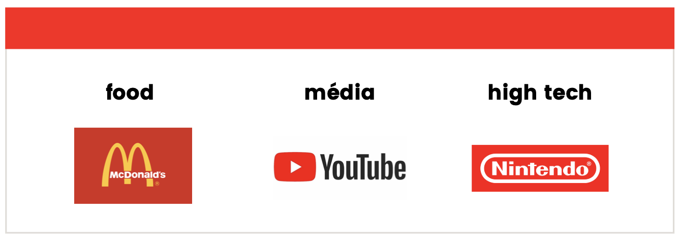
RED
Used as a logo color, your brand will appear energetic, ambitious and passionate. However, be careful because this color also evokes aggressiveness, tenacity and provocation. Internationally, red refers to mourning in Africa whereas it evokes luck in China.
Some of the main industries using this color are:
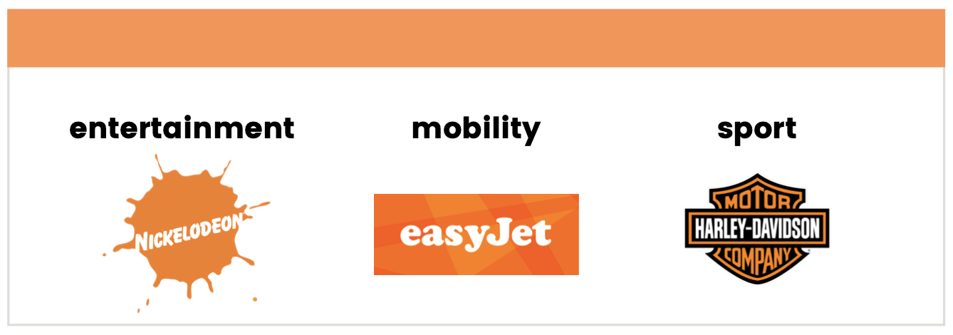
ORANGE
Used as a logo color, your brand will appear as creative, accessible and social. However, be careful because this color also evokes kitsch, caution and low-cost. Internationally, orange refers to spirituality in India whereas it evokes the revolution in Ukraine.
Some of the main industries using this color are:
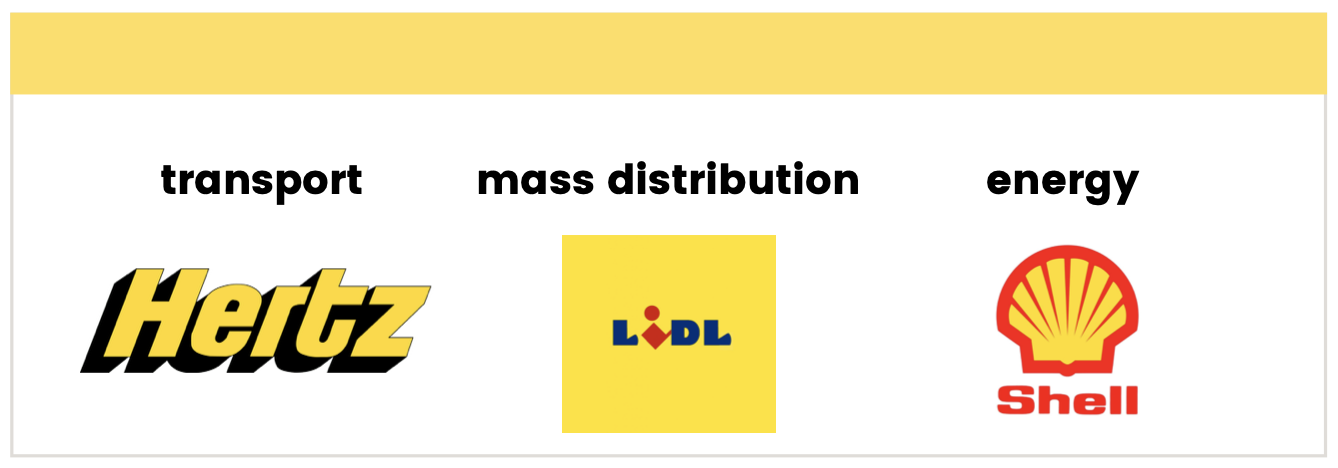
YELLOW
Used as a logo color, your brand will appear optimistic, creative and visionary. However, remain vigilant because this color also evokes treachery, disorder and selfishness. Internationally, yellow refers to royalty in Asia whereas it evokes mourning in Egypt.
Some of the main industries using this color are:
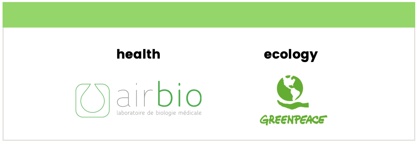
GREEN
Used as a logo color, your brand will look balanced, supportive and lucky. However, remain vigilant because this color also evokes failure and mistrust. Internationally, green refers to jealousy in the USA whereas it evokes infidelity in China.
Some of the main industries using this color are:
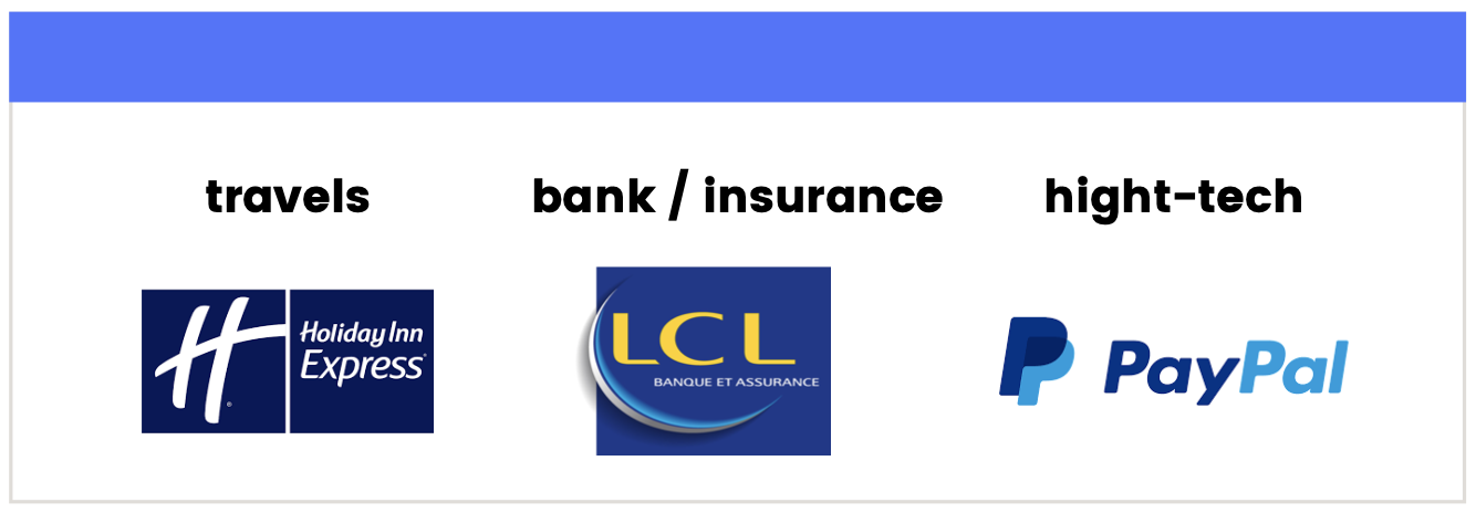
BLUE
When used as a logo color, your brand will look reassuring, honest and clever. However, be careful because this color also evokes authority, melancholy and accessibility. Internationally, blue refers to immorality in China, whereas it evokes mourning in Iran.
Some of the main industries using this color are:
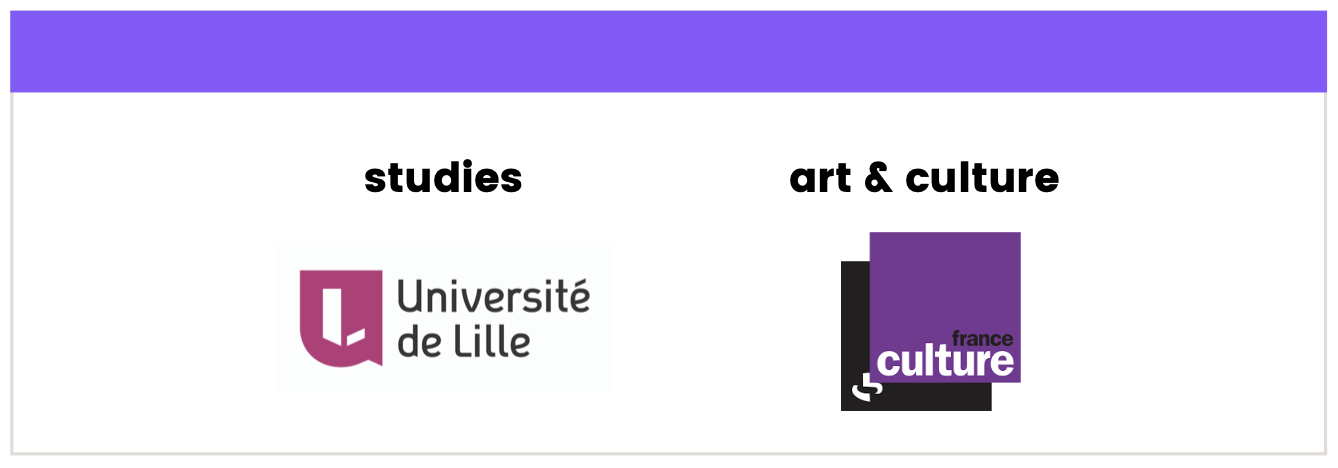
PURPLE
Used as a logo color, your brand will appear as dreamy, cultivated and noble. However, remain vigilant because this color also evokes melancholy, loneliness and dissatisfaction. Purple refers to wisdom throughout the world.
Some of the main industries using this color are:
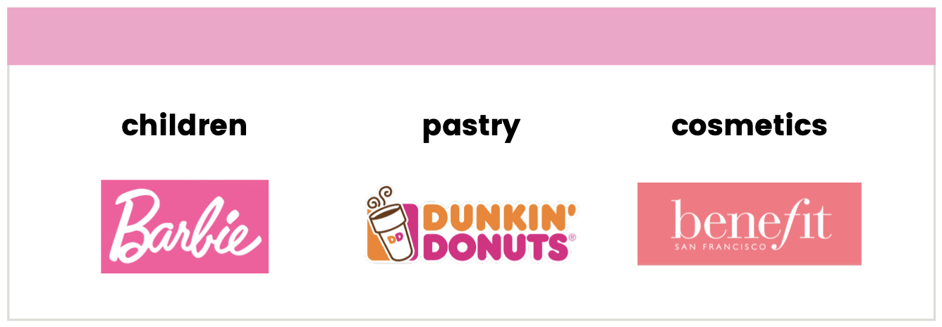
PINK
Used as a logo color, your brand will look feminine, romantic and mischievous. However, remain vigilant because this color also evokes excess, naivety and indecision. Pink refers to softness all over the world.
Some of the main industries using this color are:
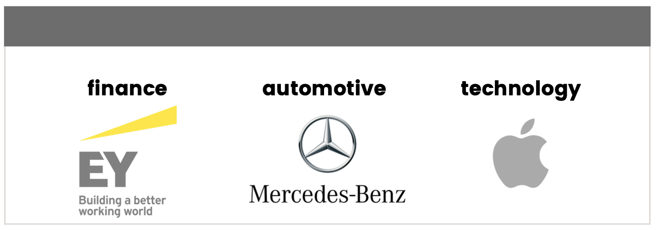
GREY
Used as a logo color, your brand will appear as rigorous, persistent and classic. However, remain vigilant because this color also evokes discretion, monotony and severity. Grey refers to neutrality around the world.
Some of the main industries using this color are:
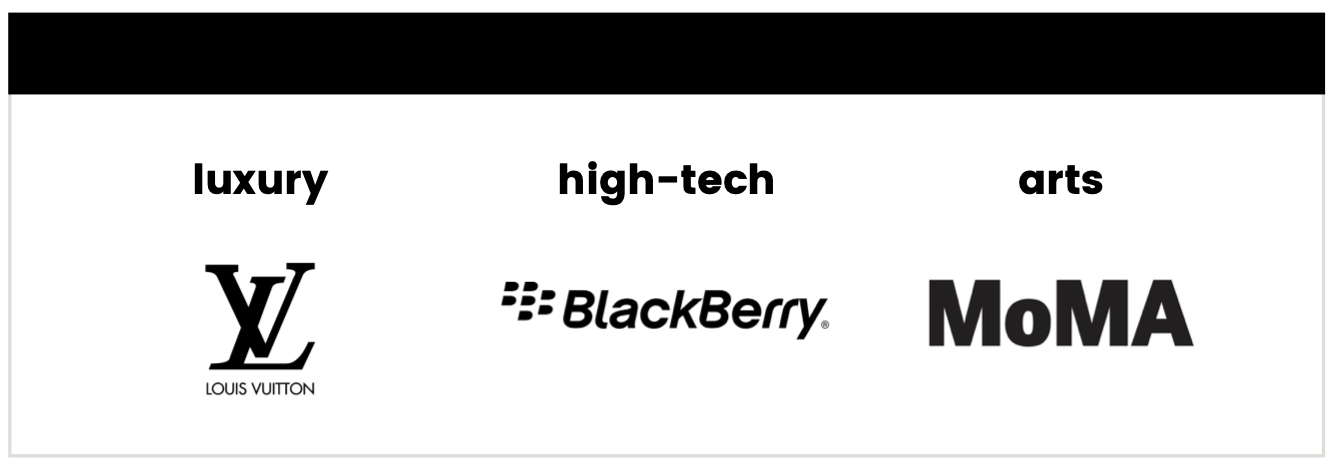
BLACK
Used as a logo color, your brand will look elegant, sober and determined. However, remain vigilant because this color also evokes fatality, pretension and obscurity. Internationally, black refers to mystery in Japan whereas it evokes bad luck in Thailand.
Some of the main industries using this color are:
You now know all about the psychology of colors. By knowing that the most loved colors in France are black, blue and green and that ⅔ of their logos are bicolored, you now just have to choose yours.
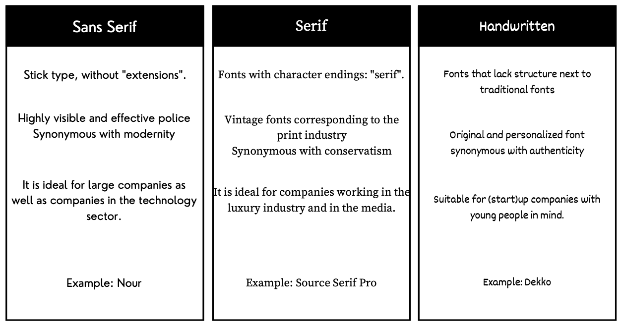
3. Typography
Typography is as important a decision as the choice of color. First, it is important to consider whether the logo will be typographic (text) or pictographic (image). And of course, it can be both. Then, it is important to make sure that the typography evokes the desired emotion and facilitates memorization. To do this, it is important that the font(s) is memorable, that it is placed in the right context and that there are only one or two.
Of course, you have to choose between serif, sans serif and handwritten typefaces, all of which evoke different values:
PS: If you want to use or just browse sites on this subject, here are 3 free typography websites:
Dafont : https://www.dafont.com/fr/
Google Fonts: https://fonts.google.com
Behance: https://www.behance.net/collection/4860923/Free-Fonts
4. Simplicity & link to your industry
As we have just seen, certain codes (colors, typography) can be constrained to sectors of activity. For example, it would certainly be unusual to create a logo for a car brand using a handwritten font and the color pink. Though nothing is stopping you from doing so!
However, it is also important not to fade into the mass of logos in your industry. Therefore, our advice would be to respect certain graphic codes of your industry but all the while adding something new.
Coming back to the color pink, this is what Airbnb did:
![]()
We saw previously the travel sector tends to use blue and that pink corresponds to childhood. Nevertheless, Airbnb respected the typography of its sector and differentiated itself thanks to its color. Its brand image is innovative and memorable.
Going hand in hand with this idea, it is important to keep the message and the shapes simple. In fact, simplicity is a tough job, but is also one that pays off.
Continuing with this example of Airbnb, we have no more than 2 colors, simple typography, and useful content.
![]()
The brand succeeds perfectly in retranscribing its values and its concept with a simple shape, using only what is essential. If you want to know more about this brand redesign, you read this article.
5. Timeless & unique
Think of the Nike, Disney or Coca-Cola logos. Have you ever seen them change in appearance? For a logo to be most effective, it must be timeless and unique. It has to be able to stand the test of time beyond trends. Avoiding short term trends will prevent you from making big changes, but more importantly from destabilizing your clientele.
Nevertheless, you can do like McDonald’s has done with all of its variations over time. In fact, since 1961, the “M” of McDonald’s has existed. Of course, it has undergone some changes, but its visual identity is still as memorable as ever.
![]()
6. Variations
Let’s imagine that your logo is green and is related to ecology. It goes without saying that you will not be able to use it on a green background or any other color that doesn’t match. Therefore, you must anticipate and adapt to all backgrounds, shapes and uses. It’s important to have these elements in mind:
- a monochrome version,
- a version for light backgrounds,
- a horizontal version, possibly a vertical version and a miniature version (in case of a logo with a mix of graphic elements and the brand name) to adapt to all mediums.
![]()
In order to maintain optimal legibility and quality, it is useful to have a vector format for your logo. This will ensure the quality of your logo no matter the resizing or distortions it may undergo depending on the final use (business cards, posters, website, social media or even a truck …).
PS: Some examples of useful software for this are Adobe Illustrator, CoreLDraw and Inscape.
7. Points of vigilance: international use & protection
Before closing these tips for creating a logo, we will see two points of vigilance.
As we have seen previously (in the paragraph about colors), it is possible that some codes differ depending on the country. Indeed, colors do not have the same meaning from one country to another, just like words.
It’s possible that your trade name, slogan or product name has a different meaning in another country.
For example, KFC has translated its slogan “Finger-Lickin’ Good” into “Eat Your Fingers Off” in mainland China.
![]()
We therefore advise you to check the meaning of your terms in the countries you want to do business in.
In addition to this, we advise you to legally protect your creation. You can first check on the INPI (Institut National de la Propriété Industrielle) website that your logo / company name is not already in use. Then, you can register your creation, with INPI to guarantee exclusivity of your logo and name.
Conclusion
To conclude, there are many essential phases in the creation of a logo. Depending on your activity, your location and your audience, the codes will not be the same and the result will differ. Bear in mind that it is important to do some brainstorming which will allow you to properly choose your colors, typography, etc.. Keep it simple and unique. Also remember to check the meaning of your logo in other countries. Better yet, call upon an agency that will check all these boxes for you  .
.