

For all those who prefer a standard form, here is a transcription of the infographics above.
Happy reading and don’t hesitate to let us know what you think of it!
INTRODUCTION
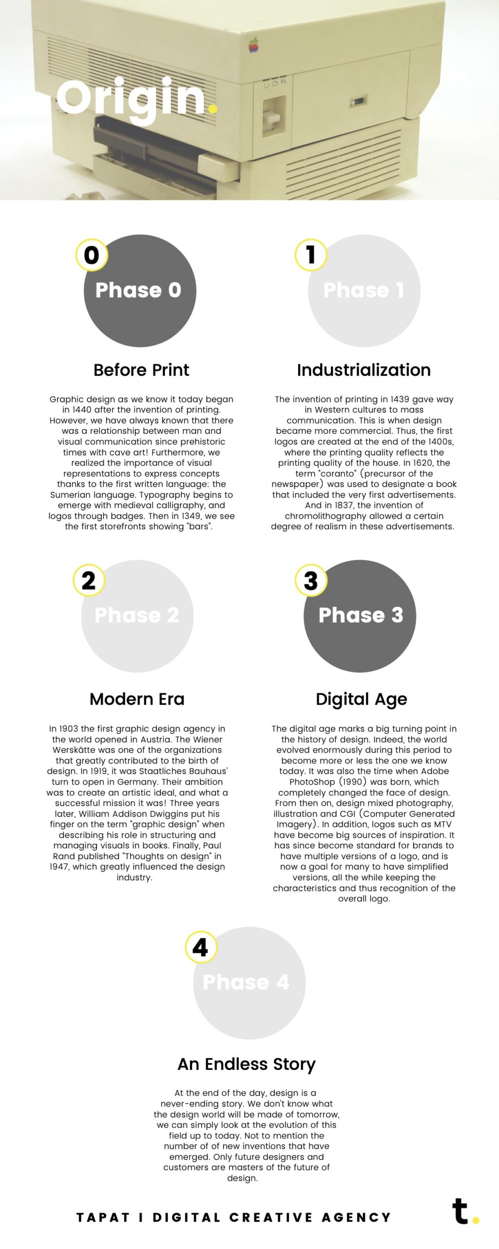
Do you know how we arrived at today’s version of what we call “graphic design”? And how long it took to get here? Actually, the process that made design what it is today has taken quite a while. Let’s take a closer look:
Before print:
Graphic design as we know it today began in 1440 after the invention of printing. However, we have always known that there was a relationship between man and visual communication since prehistoric times with cave art! Furthermore, we realized the importance of visual representations to express concepts thanks to the first written language: the Sumerian language. Typography begins to emerge with medieval calligraphy, and logos through badges. Then in 1349, we see the first storefronts showing “bars”.
Industrialization:
The invention of printing in 1439 gave way in Western cultures to mass communication. This is when design became more commercial. Thus, the first logos are created at the end of the 1400s, where the printing quality reflects the printing quality of the house. In 1620, the term “coranto” (precursor of the newspaper) was used to designate a book that included the very first advertisements. And in 1837, the invention of chromolithography allowed a certain degree of realism in these advertisements.
Modern Era:
In 1903 the first graphic design agency in the world opened in Austria. The Wiener Werskätte was one of the organizations that greatly contributed to the birth of design. In 1919, it was Staatliches Bauhaus’ turn to open in Germany. Their ambition was to create an artistic ideal, and what a successful mission it was! Three years later, William Addison Dwiggins put his finger on the term “graphic design” when describing his role in structuring and managing visuals in books. Finally, Paul Rand published “Thoughts on design” in 1947, which greatly influenced the design industry.
Digital Age:
The digital age marks a big turning point in the history of design. Indeed, the world evolved enormously during this period to become more or less the one we know today. It was also the time when Adobe PhotoShop (1990) was born, which completely changed the face of design. From then on, design mixed photography, illustration and CGI (Computer Generated Imagery). In addition, logos such as MTV have become big sources of inspiration. It has since become standard for brands to have multiple versions of a logo, and is now a goal for many to have simplified versions, all the while keeping the characteristics and thus recognition of the overall logo.
An Endless story:
At the end of the day, design is a never-ending story. We don’t know what the design world will be made of tomorrow, we can simply look at the evolution of this field up to today. Not to mention the number of new inventions that have emerged. Only future designers and customers are masters of the future of design.
HISTORY
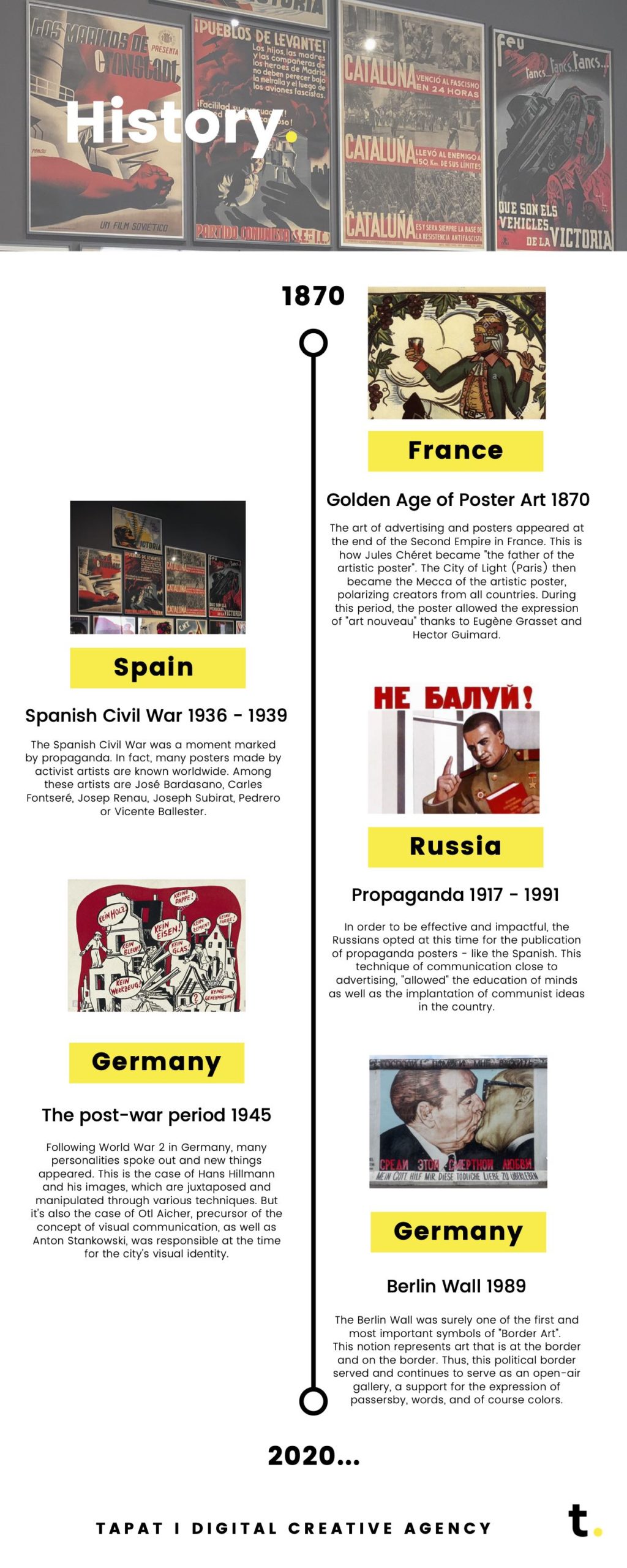
Historically speaking, design has marked many periods. Indeed, it is a very good way to express oneself and to get a message across, and many countries have understood this:
France: Golden Age of Poster Art 1870
The art of advertising and posters appeared at the end of the Second Empire in France. This is how Jules Chéret became “the father of the artistic poster”. The City of Light (Paris) then became the Mecca of the artistic poster, polarizing creators from all countries. During this period, the poster allowed the expression of “art nouveau” thanks to Eugène Grasset and Hector Guimard.
Spain: Spanish Civil War 1936 – 1939
The Spanish Civil War was a moment marked by propaganda. In fact, many posters made by activist artists are known worldwide. Among these artists are José Bardasano, Carles Fontseré, Josep Renau, Joseph Subirat, Pedrero or Vicente Ballester.
Russia: Propaganda 1917 – 1991
In order to be effective and impactful, the Russians opted at this time for the publication of propaganda posters – like the Spanish. This technique of communication close to advertising, “allowed” the education of minds as well as the implantation of communist ideas in the country.
Germany: The post-war period 1945
Following World War 2 in Germany, many personalities spoke out and new things appeared. This is the case of Hans Hillmann and his images, which are juxtaposed and manipulated through various techniques. But it’s also the case of Otl Aicher, precursor of the concept of visual communication, as well as Anton Stankowski, was responsible at the time for the city’s visual identity.
Germany: Berlin Wall 1989
The Berlin Wall was surely one of the first and most important symbols of “Border Art”.
This notion represents art that is at the border and on the border. Thus, this political border served and continues to serve as an open-air gallery, a support for the expression of passersby, words, and of course colors.
PERSONALITY
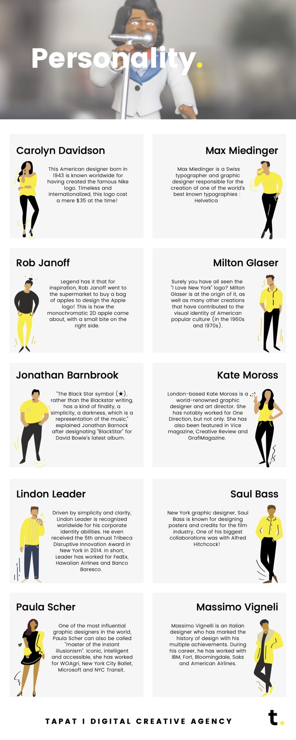
Ever wondered where the Nike logo came from? Who was behind the trends and icons of graphic design. Here is a selection of 10 designers who have made design history:
Carolyn Davidson: This American designer born in 1943 is known worldwide for having created the famous Nike logo. Timeless and internationalized, this logo cost a mere $35 at the time!
Max Miedinger: Max Miedinger is a Swiss typographer and graphic designer responsible for the creation of one of the world’s best known typographies : Helvetica
Rob Janoff: Legend has it that for inspiration, Rob Janoff went to the supermarket to buy a bag of apples to design the Apple logo! This is how the monochromatic 2D apple came about, with a small bite on the right side.
Milton Glaser: Surely you have all seen the “I Love New York” logo? Milton Glaser is at the origin of it, as well as many other creations that have contributed to the visual identity of American popular culture (in the 1960s and 1970s).
Jonathan Barnbrook: “The Black Star symbol (★), rather than the Blackstar writing, has a kind of finality, a simplicity, a darkness, which is a representation of the music,” explained Jonathan Barnock after designating “BlackStar” for David Bowie’s latest album.
Kate Moross: London-based Kate Moross is a world-renowned graphic designer and art director. She has notably worked for One Direction, but not only. She has also been featured in Vice magazine, Creative Review and GrafiMagazine.
Lindon Leader: Driven by simplicity and clarity, Lindon Leader is recognized worldwide for his corporate identity abilities. He even received the 5th annual Tribeca Disruptive Innovation Award in New York in 2014. In short, Leader has worked for FedEx, Hawaiian Airlines and Banco Baresco.
Saul Bass: New York graphic designer, Saul Bass is known for designing posters and credits for the film industry. One of his biggest collaborations was with Alfred Hitchcock!
Paula Scher: One of the most influential graphic designers in the world, Paula Scher can also be called “master of the instant illusionism”. Iconic, intelligent and accessible, she has worked for WOAgri, New York City Ballet, Microsoft and NYC Transit.
Massimo Vigneli: Massimo Vignelli is an Italian designer who has marked the history of design with his multiple achievements. During his career, he has worked with IBM, Fort, Bloomingdale, Saks and American Airlines.
Of course, this list is not exhaustive!
EXAMPLE – BANANIA
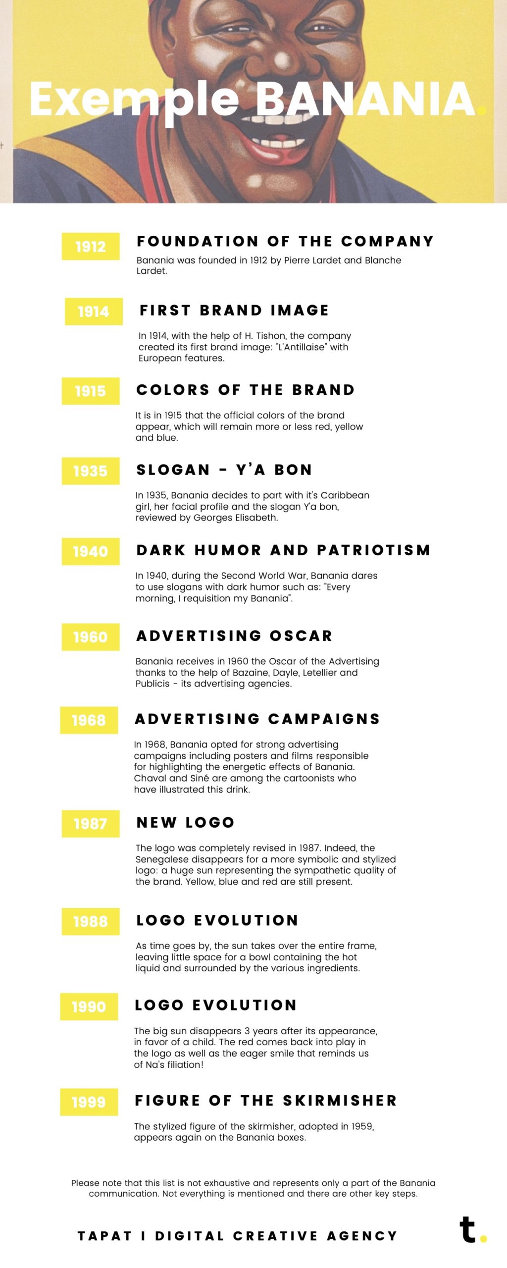
We know where the design comes from, how it was used and by whom. Now, let’s see an example of design evolution over time through a well-known brand – BANANIA (1912-1999) :
1912 – Foundation of the company: Banania was founded in 1912 by Pierre Lardet and Blanche Lardet.
1914 – First brand image: In 1914, with the help of H. Tishon, the company created its first brand image: “L’Antillaise” with European features.
1915 – Colors of the brand: It is in 1915 that the official colors of the brand appear, which will remain more or less red, yellow and blue.
1935 – SLOGAN – Y’a bon: In 1935, Banania decides to part with it’s Caribbean girl, her facial profile and the slogan Y’a bon, reviewed by Georges Elisabeth.
1940 – Dark humor and patriotism: In 1940, during the Second World War, Banania dares to use slogans with dark humor such as: “Every morning, I requisition my Banania”.
1960 – Advertising Oscar: Banania received in 1960 the Oscar of the Advertising thanks to the help of Bazaine, Dayle, Letellier and Publicis – its advertising agencies.
1968 – Advertising campaigns: In 1968, Banania opted for strong advertising campaigns including posters and films responsible for highlighting the energetic effects of Banania. Chaval and Siné are among the cartoonists who have illustrated this drink.
1987 – New logo: The logo was completely revised in 1987. Indeed, the Senegalese disappears for a more symbolic and stylized logo: a huge sun representing the sympathetic quality of the brand. Yellow, blue and red are still present.
1988 – Logo evolution: As time goes by, the sun takes over the entire frame, leaving little space for a bowl containing the hot liquid and surrounded by the various ingredients.
1990 – Logo evolution: The big sun disappears 3 years after its appearance, in favor of a child. The red comes back into play in the logo as well as the eager smile that reminds us of Na’s filiation!
1999 – Figure of the skirmisher: The stylized figure of the skirmisher, adopted in 1959, appears again on the Banania boxes.
Please note that this list is not exhaustive and represents only a part of the Banania communication. Not everything is mentioned and there are other key steps.
CONCLUSION
In conclusion, design is for everything and is everywhere. Thanks to its invention, it is possible to convey powerful messages, to communicate both about history and a brand image. Indeed, each brand now has its own logo, which allows it to be visually represented.
If you want to know more or if you need a custom design, don’t hesitate to get in touch!