
For all those who prefer a standard form, here is a transcript of the above infographic.
Enjoy reading it and don’t hesitate to tell us what you think!
INTRODUCTION
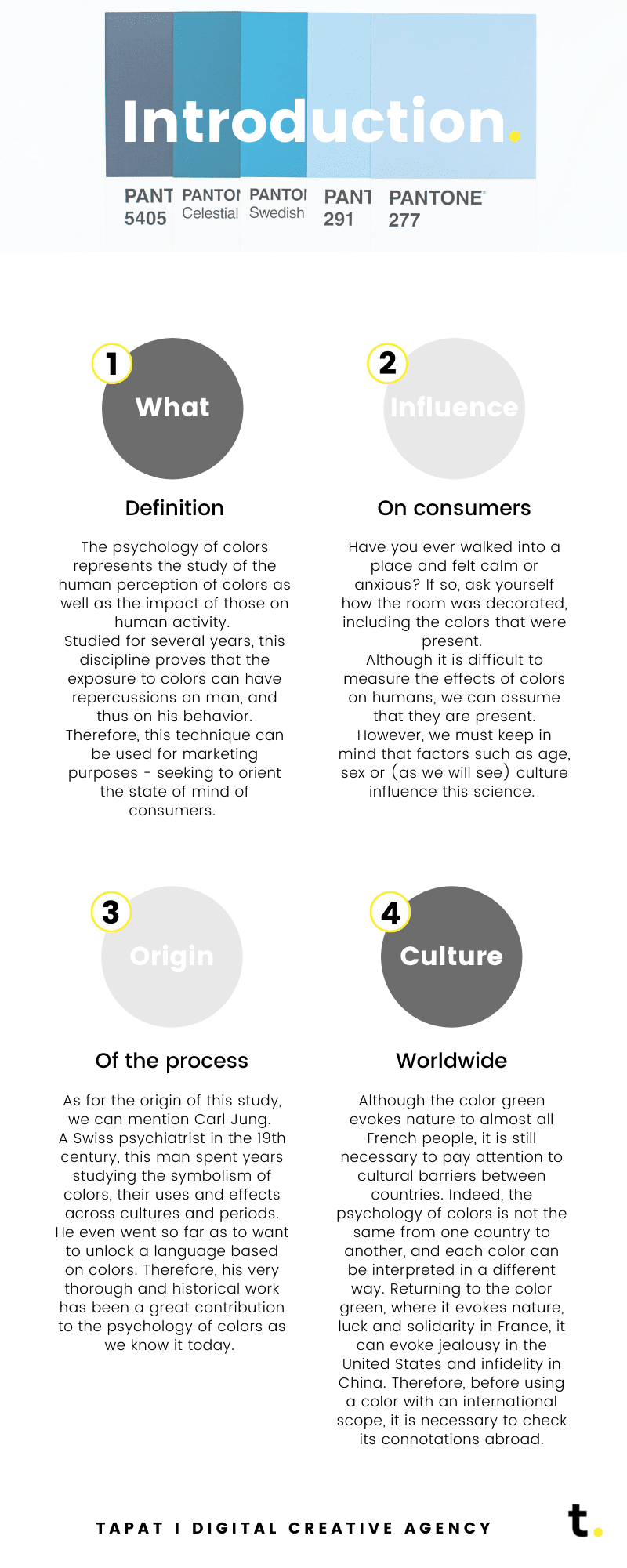
What – Definition
The psychology of colors represents the study of the human perception of colors as well as the impact of those on human activity. Studied for several years, this discipline proves that the exposure to colors can have repercussions on man, and thus on his behavior. Therefore, this technique can be used for marketing purposes – seeking to orient the state of mind of consumers.
Influence – On consumers
Have you ever walked into a place and felt calm or anxious? If so, ask yourself how the room was decorated, including the colors that were present.
Although it is difficult to measure the effects of colors on humans, we can assume that they are present. However, we must keep in mind that factors such as age, sex or (as we will see) culture influence this science.
Origin – Of the process
As for the origin of this study, we can mention Carl Jung.
A Swiss psychiatrist in the 19th century, this man spent years studying the symbolism of colors, their uses and effects across cultures and periods. He even went so far as to want to unlock a language based on colors. Therefore, his very thorough and historical work has been a great contribution to the psychology of colors as we know it today.
Culture – Worldwide
Although the color green evokes nature to almost all French people, it is still necessary to pay attention to cultural barriers between countries. Indeed, the psychology of colors is not the same from one country to another, and each color can be interpreted in a different way. Returning to the color green, where it evokes nature, luck and solidarity in France, it can evoke jealousy in the United States and infidelity in China. Therefore, before using a color with an international scope, it is necessary to check its connotations abroad.
Mémento
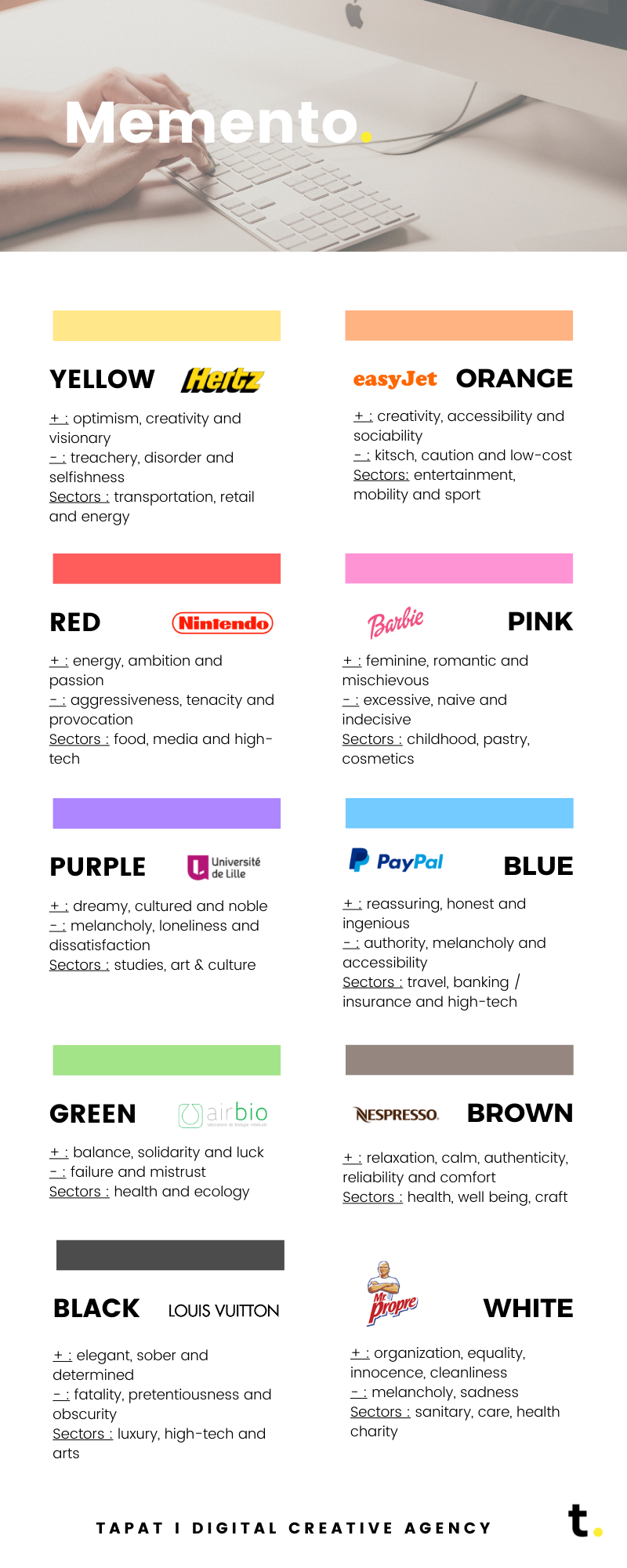
Yellow
+ : optimism, creativity and visionary
– : treachery, disorder and selfishness
Sectors : transportation, retail and energy
Orange
+ : creativity, accessibility and sociability
– : kitsch, caution and low-cost
Sectors: entertainment, mobility and sport
Red
+ : energy, ambition and passion
– : aggressiveness, tenacity and provocation
Sectors : food, media and high-tech
Pink
+ : feminine, romantic and mischievous
– : excessive, naive and indecisive
Sectors : childhood, pastry, cosmetics
Purple
+ : dreamy, cultured and noble
– : melancholy, loneliness and dissatisfaction
Sectors : studies, art & culture
Blue
+ : reassuring, honest and ingenious
– : authority, melancholy and accessibility
Sectors : travel, banking / insurance and high-tech
Green
+ : balance, solidarity and luck
– : failure and mistrust
Sectors : health and ecology
Brown
+ : relaxation, calm, authenticity, reliability and comfort
Sectors : health, well being, craft
Black
+ : elegant, sober and determined
– : fatality, pretentiousness and obscurity
Sectors : luxury, high-tech and arts
White
+ : organization, equality, innocence, cleanliness
– : melancholy, sadness
Sectors : sanitary, care, health charity
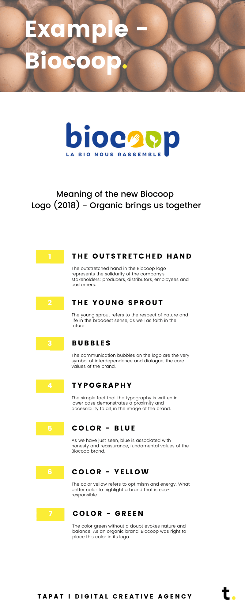
Meaning of the new Biocoop Logo (2018) – Organic brings us together
The outstretched hand
The outstretched hand in the Biocoop logo represents the solidarity of the company’s stakeholders: producers, distributors, employees and customers.
The young sprout
The young sprout refers to respect for nature and life in the broad sense, as well as faith in the future.
Bubbles
The communication bubbles on the logo are the very symbol of interdependence and dialogue, the core values of the brand.
Typography
The simple fact that the typography is written in lower case demonstrates a proximity and accessibility to all, in the image of the brand.
Couleur – blue
As we have just seen, blue is associated with honesty and reassurance, fundamental values of the Biocoop brand.
Couleur – yellow
The color yellow refers to optimism and energy. What better color to highlight a brand that is eco-responsible.
Couleur – green
The color green without a doubt evokes nature and balance. As an organic brand, Biocoop was right to place this color in its logo.
CONCLUSION
Colors play a crucial role in a company’s branding and communication and in its perception by the public – which can vary depending on the background and culture of the public! Do you need support in your branding or in the creation of your communication materials? Contact us!