
Have you ever heard of user experience (UX) or user interface (UI)? These two notions play an essential role in a digitization context because they allow a user-centered approach.
Let’s try to understand in depth what these two notions are.
Context
https://i.redd.it/h0i7zd5lwcky.jpg
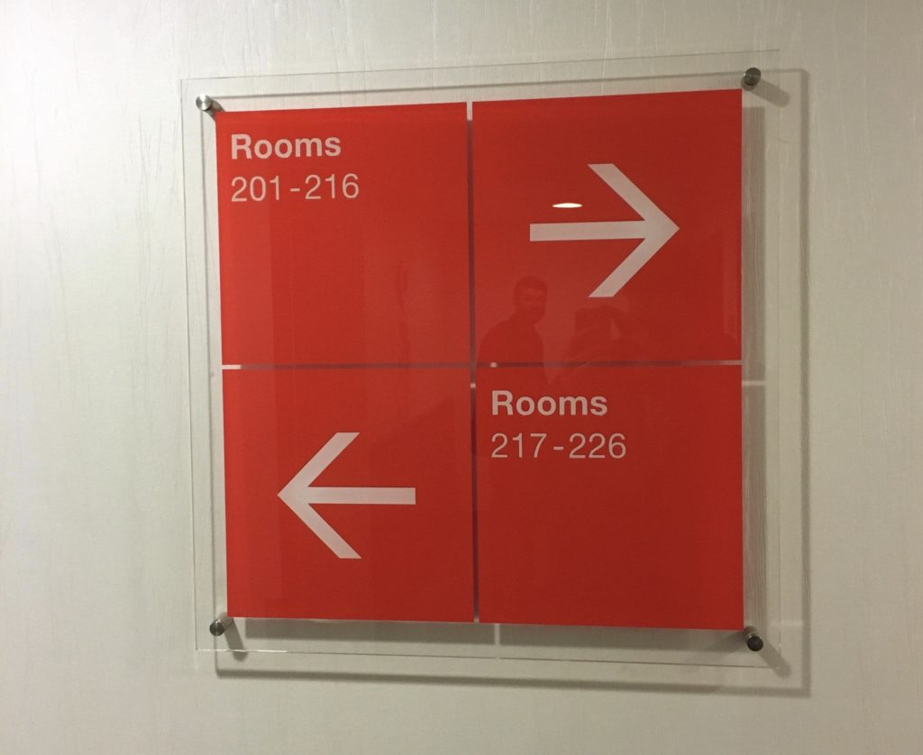
If you look at the picture above, what comes to mind? Do you know where to go if you want to go to room 220? You can immediately notice that the graphic design is very aesthetic: when it applies to screens, it’s called interface design (UI). However, there is a good chance that when you are in front of the sign – with the intention of going to room 220 – you don’t know whether to take into account the top arrow or the bottom arrow. Therefore, the interface design is useless because it provides users with a bad experience (UX).
In other words, the users’ needs are not taken into consideration. If the sign had been thought-out and made to be a good indicator, then its design would have resulted in a good user experience.
Herein lies the challenge of UX and UI, and this design is all the more important in a digital medium.
UX – User Experience
As previously indicated, the term UX is the abbreviation for User Experience.
Don Norman, inventor of the term “user experience” once said: “No product is an island. A product is more than the product. It is a coherent and integrated set of experiences. Think of all the stages of a product or service, from initial intentions to final thoughts, from first use to support and maintenance. Make sure they all work together seamlessly”.
In other words, it’s not enough to design a product that meets systematic needs, you also need to think about everything that contributes to a good user experience. And to do this, you need to think of a user experience that meets a specific need, in a specific context, for a specific user.
UX designers are constantly focused on the why, what and how. In other words, they seek to understand users’ motivations, values and points of view (why), but also the functionality and features of the product (what), while thinking about the accessibility and aesthetics of the product (how).
Therefore, the tasks of a UX designer are varied but always include user research, creating personas, designing interactive wireframes and prototypes, and testing designs.
UI – User Interface
As mentioned above, the term UI is an abbreviation for User Interface. There are three main forms of UI, which are graphic user interfaces (GUIS), voice-controlled interfaces (VCIS) and gesture-based interfaces. In all cases, the idea is to build interfaces in software or computerized devices, focusing on look and feel.
To do so, it is important to take into account that users judge a design very quickly and pay close attention to its usability. In addition, it is important that user interfaces are pleasant and satisfying (without frustration), all the while communicating brand values.
Compared to UX design, it can be said that UI design focuses more on the surface and the overall impression of the design.
Don Norman once said: “”Interfaces get in the way. I don’t want to focus my energies on one interface. I want to focus on the work.” This quote implies that for a user interface to be successful, the user shouldn’t have to pay attention to it, he just has to fly over it with ease and enthusiasm.
In order to make a good user interface, certain principles may be good to take into consideration:
- Design buttons and other graphic elements that users can find and use everywhere unconsciously.
- Keep a certain amount discovery, no need to reveal everything on the first page
- Keep interfaces simple and create invisible sensations
- Consider users’ attention to layout: use clean alignment – draw attention to key features
- Minimize the number of actions and focus on one key function per page
- Place interactions next to items where users are looking to interact
- Keep users informed about the response system / actions requiring feedback
- Use appropriate UI design templates to aid user intuition
- Maintain brand consistency
- Always indicate the next step so that users can progress naturally, regardless of the context.
In other words…
In order to better understand, I suggest making a direct comparison between UX design and UI design.
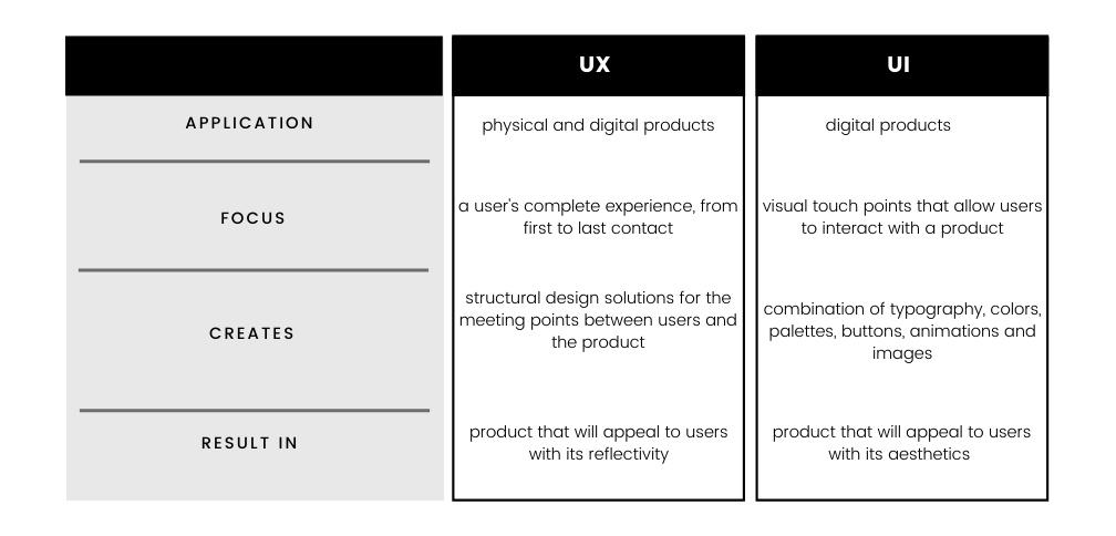
Here we notice that UX and UI do not have the same fields of application, focus, creation and result.
User experience design consists in developing and improving the quality of interaction between a user and all facets of a company. It is therefore not a question of visuals, but of the overall impression of the experience.
User interface design, on the other hand, takes into account all the visual and interactive elements of a product’s interface (buttons, icons, spaces, typography, color palette and interactive design). The objective is to visually guide the user through a product’s interface, ensuring that the design is consistent, homogeneous and visually pleasing.
Example: LYDIA
To illustrate these two notions, let’s take the example of Lydia. This French application was designed to facilitate payments between relatives, friends etc. Indeed, one of the biggest concepts of this system is that it is possible to make a transfer to a person in just a few seconds via a phone number that is directly linked to a bank account.
In this case, the UX has been designed so that users can make a transfer very quickly to anyone as long as they have their phone number, and without revealing any bank details.
A list of the transactions carried out is then displayed to follow the thread of its operations.
As for the user interface, it is the whole design thought to represent the experience.
In this case, we can assume that blue is used to respect Lydia’s brand guides (as it is the color of the logo), but also because it reminds us of loyalty, justice and faith. Moreover, the typography, which is also a part of their overall branding, is neutral and reassuring.
And so, in 4 pages (amount, recipient, description, result), you’ve made a transfer!
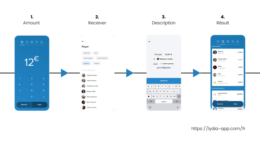
Here we can see that everything is well thought out in Lydia’s app. The user encounters no obstacles from the beginning to the end of their experience with the product. The visuals are minimal but highlight very well the essential information (amount, recipient, description and result).
The user experience (UX) therefore represents the path and features that the user will use on the site (or application etc.), and what he gets out of it (good or bad experience, the desire to come back or not). While the user interface (UI) applies to all the ergonomics of the site, its visuals, colors, typography, etc.. It is essential that the UI is correctly designed to respond well to the UX.
Conclusion
If we take the example of an iceberg, we can consider that the UI represents the visible tip of the iceberg while the UX represents the hidden part. Well coordinated, these two notions constitute a full and good user experience.
Here at TAPAT, we specialize in UI and UX. To know more, have look at our work.