In this new year, we wish you all the best for 2021! But we also want to provide you with some new blog posts, for you to better understand our world. Starting with the 9 web trends for 2021.
In order to adapt to the evolution of technologies and trends, it is recommended to review a website every three or four years. With the year we have just had, it is highly likely that people are looking for new things, including on the internet.
Therefore, we’ve made a compilation of the nine most important web trends to look out for in 2021.
SUMMARY :
1. NEO-MORPHISM
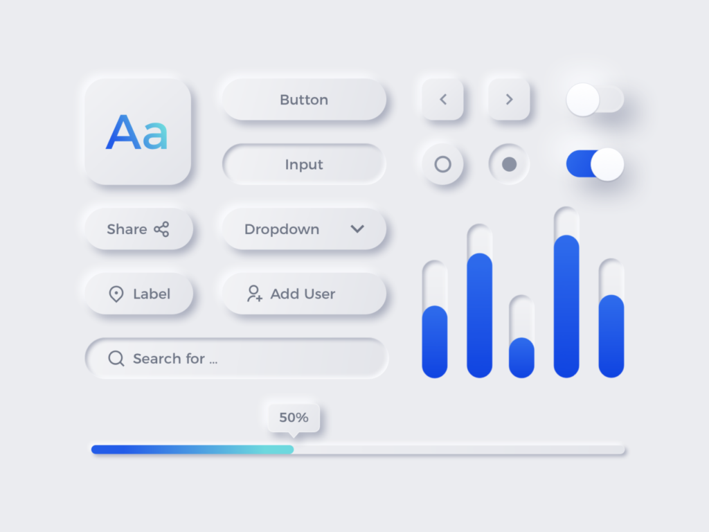
Neomorphism can be defined as a fusion of skeuomorphism and flat design. Where one consists in using the familiar and the obsolete for a representation of current objects (skeuomorphism), the other consists in using colors to create easily identifiable icons (flat design). Neomorphism imitates the appearance of objects through shadow effects, while being full of semi-flat colors. The result is a strengthening of the link between the user and the design he interacts with. Most often on buttons, search bars and text boxes, this technique will be omnipresent in 2021, the era of minimalist realism.
In order to better visualize it, here is a perfect example of neomorphism design below :
2. INTERACTION
For the past few years and more than ever in 2020, e-commerce has been an essential way of selling products and services. It is estimated that by the end of 2020, e-commerce has grown by almost 20%, which is considerable. Therefore, it is important to develop user-centric websites and applications.
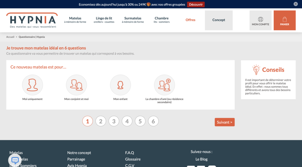
Seeing as one of the most crucial moments is when the user arrives on a landing page, we might as well make the user’s experience as enjoyable as possible. And to do this, what better way than through interactive forms? Not only does this technique allow us to know their needs, but also to provide them with a more interactive experience. These forms, which will be at their peak in 2021, give users the impression that they are part of the service before they have even purchased it. Hypnia has understood this very well by proposing 6 questions to find their ideal mattress.
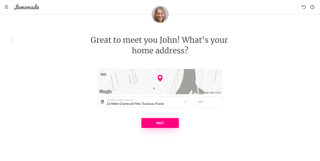
Another example below is Lemonade, that allows you to seek out an insurance quote by having a seemingly normal conversation with a bot.
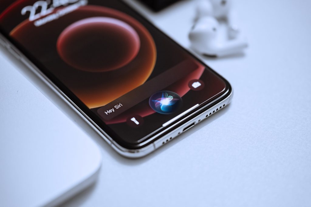
This leads us to chatbots and speech recognition. Chatbots interact 24/7 and facilitate the adaptability of the site for people with disabilities, or any other person asking for help. When it comes to speech recognition, since 55% of households have it (Google Assistant, Alexa by Amazon, Siri by Apple, Bixby by Android, Celia by Huawei), you might as well take it into account the keywords on your website, simply by writing more and more content in “spoken language”.
3. TYPOGRAPHY
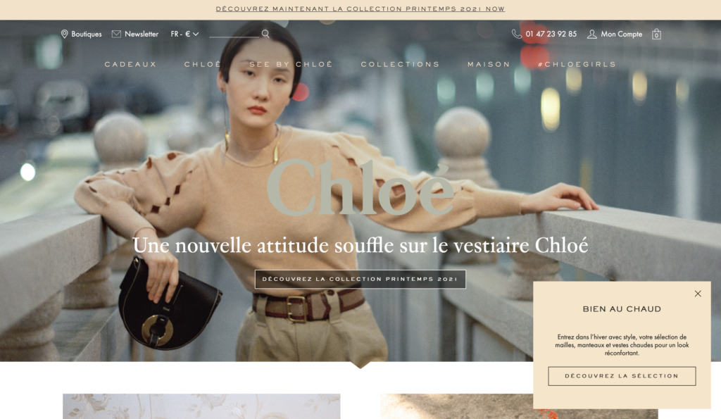
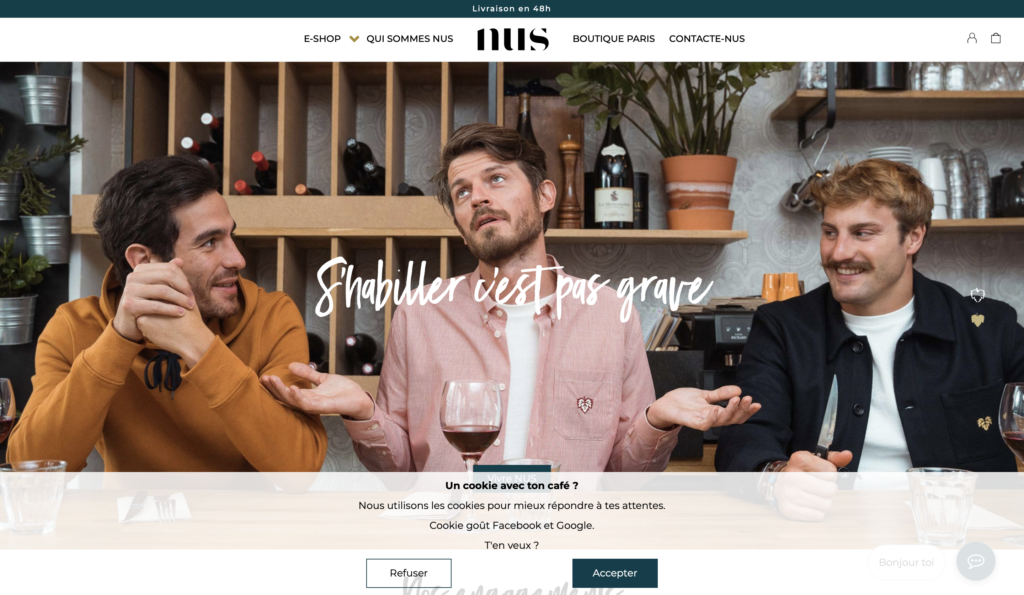
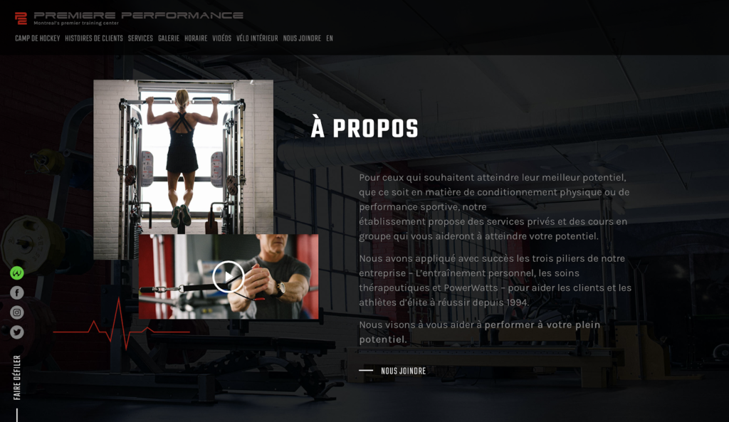
Typography has always been an essential element of graphic design, including web design. What is certain for 2021 is that text will get noticed. Indeed, the fonts are getting wider and wider, with thicker and tighter letters. The website will therefore appear modern, and thanks to a good hierarchy in your content and a good application of title tags it will also help you to optimize your website’s SEO.
To check it out, you can go to the website “Chloé”, a fashion brand that leaves nothing to chance.
4. COLORS
Where colors are as important as typography in web design, it is not one but several trends that are emerging in 2021.
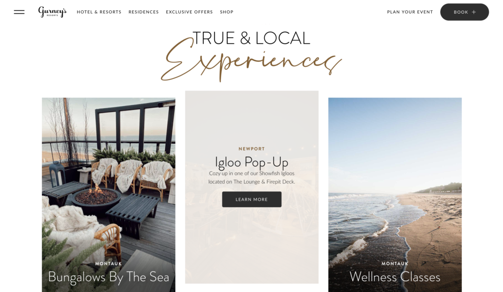
On the one hand, some designers use soft colors. This is simply because most users already spend a good part of their time working in front of their computers, and this causes eye strain. One of the best ways to alleviate these problems is to use appropriate colors. In the same way, since the past year has been relatively stressful for everyone, soft colors provide a certain serenity that is quite welcome.
Gurney’s Resort has integrated this solution into its website which full of light and warm colors.
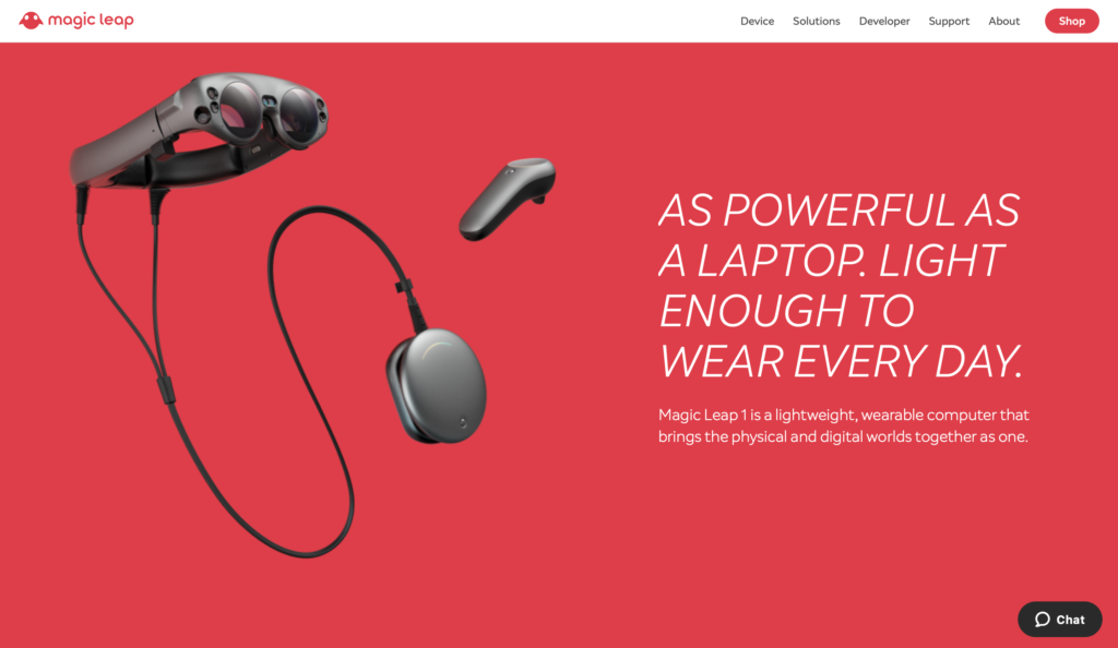
On the other hand, some designers have opted for a completely different technique: three-dimensional colors, experimental colors and fantasy colors. They opt for boldness and liveliness. This technique aims to create radical effects different from what we are used to seeing. Using a vivid color as a backdrop instead of white draws attention to the other elements on the page.
This is the case with Magic Leap, for example, which uses a very vivid background color to emphasize the product itself.
5. ANIMATION
Interaction brings websites to life and brings them closer to their users. There is a second technique that arrives at a similar result: animation! By animation, we mean several styles and trends:
Parallax animation
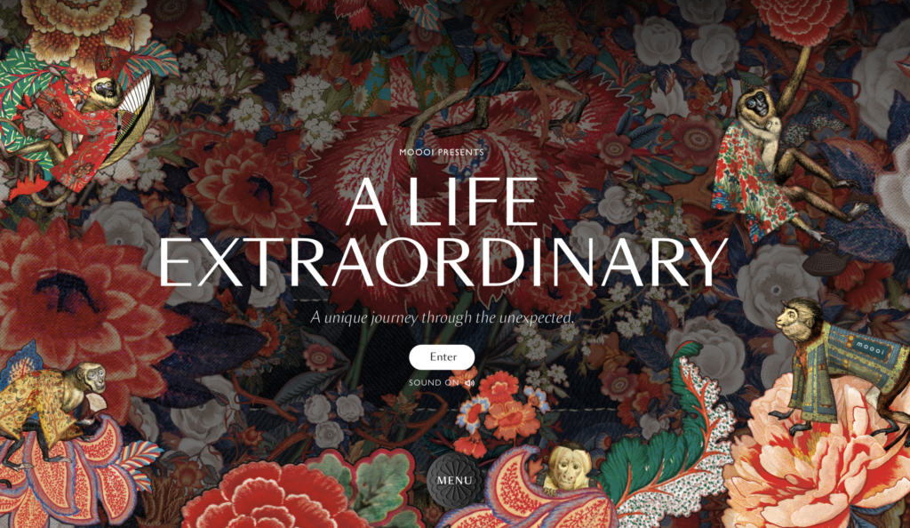
The parallax effect consists of separating the elements in the foreground and background. This optical illusion occurs when the closest objects move “faster” than those further away. Placed in a web context, this effect creates a feeling of immersion, which attracts users to meaningful elements.
To better visualize this, I recommend you to check out Moooi’s website right here!
Cartoon illustration
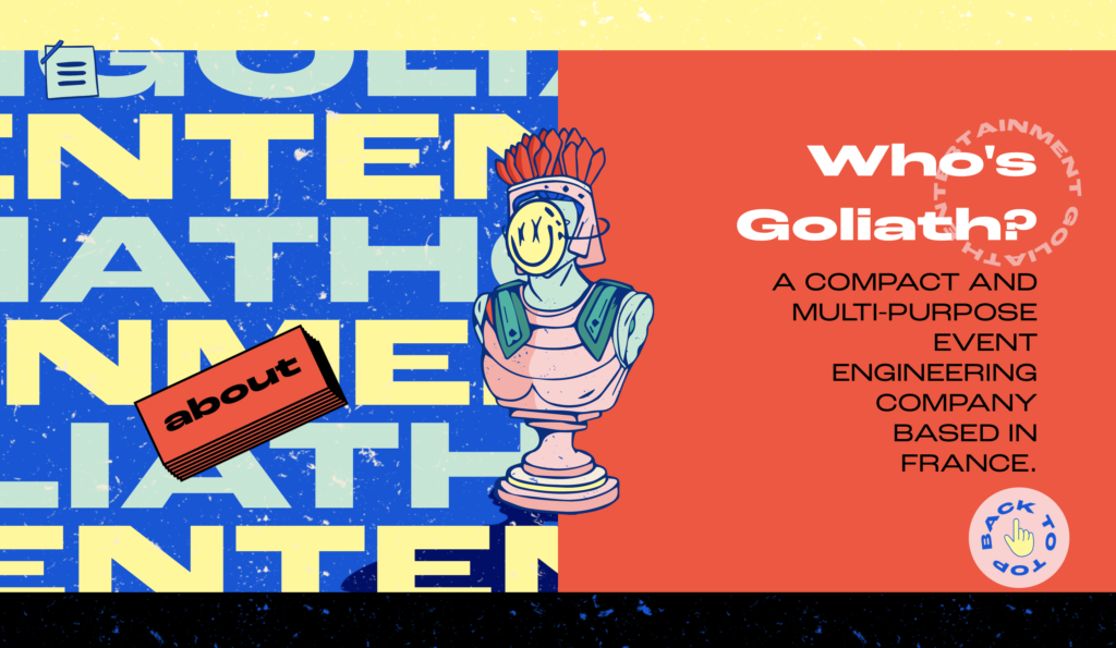
The idea of letting web designers be poetic and allowing their imagination to run wild seems to be a very good idea in 2021. Indeed, this trend that has been present for a few years now seems to create a natural link with the web user. Going from a central element to decorative background elements, these illustrations are adaptive and will depend on each designer’s style.
If you scroll through Goliath’s website, you will find that the designer who created it draws us into his graphic universe.
Micro-interaction animation
By reading our UX-UI article, you have surely realized what is at stake with these features. These elements are essential and will continue to be more and more. Therefore, everything related to them, including micro-interactions, will live on in 2021. Ranging from simple buttons to photos, these elements, once animated, will combine the useful with the playful.
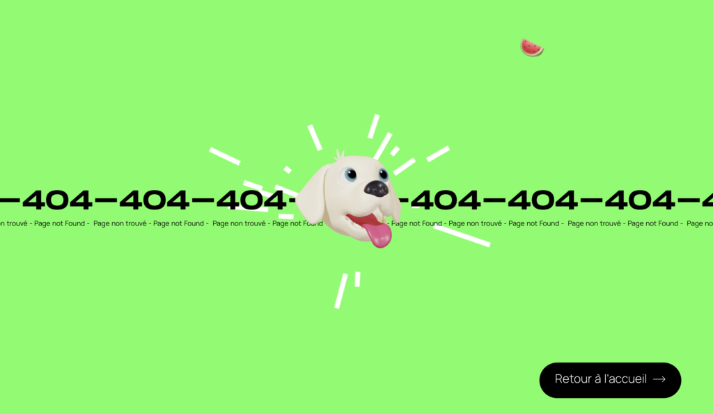
Take a look, for example, at this Squadeasy error-404 page that animates a dog and a watermelon.
Background animation
Have you noticed that video content is now everywhere on screens? This type of content today is no longer there to simply entertain the user, but now exists to provide relevant information. As a result, we can see that in 2021, more and more backgrounds will be animated, allowing for an immersive user experience.
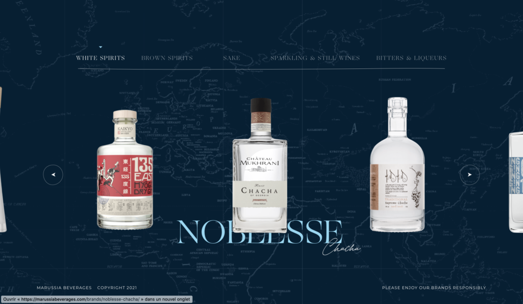
This is the case of Marussia Beverage that moves the map found in the background depending on the origin of the product (Example: the Chacha drink comes from Georgia).
Animation and dynamic illustrations
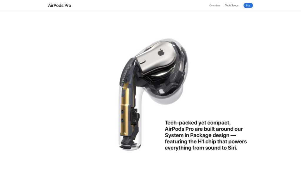
If you are not a fan of video content because of long page loads, you can always use dynamic illustrations, which can be very diverse. To illustrate this notion, let’s take the example of Apple’s new AirPods.
There is no video content on this page per se, and yet in the end we know exactly what we’re dealing with. You can quickly see how the product works, what its features are, and what makes it different from other products. All this with a short load time.
6. SIMPLICITY
We often talk about a web page’s load time. In 2021, users don’t want to waste time waiting for a page to load. Therefore one of the answers, which is becoming a trend, is to develop simple websites. But be aware, simplicity does not mean that it’s easily done. Simplicity also rhymes with pleasant, soothing, and straight forward.
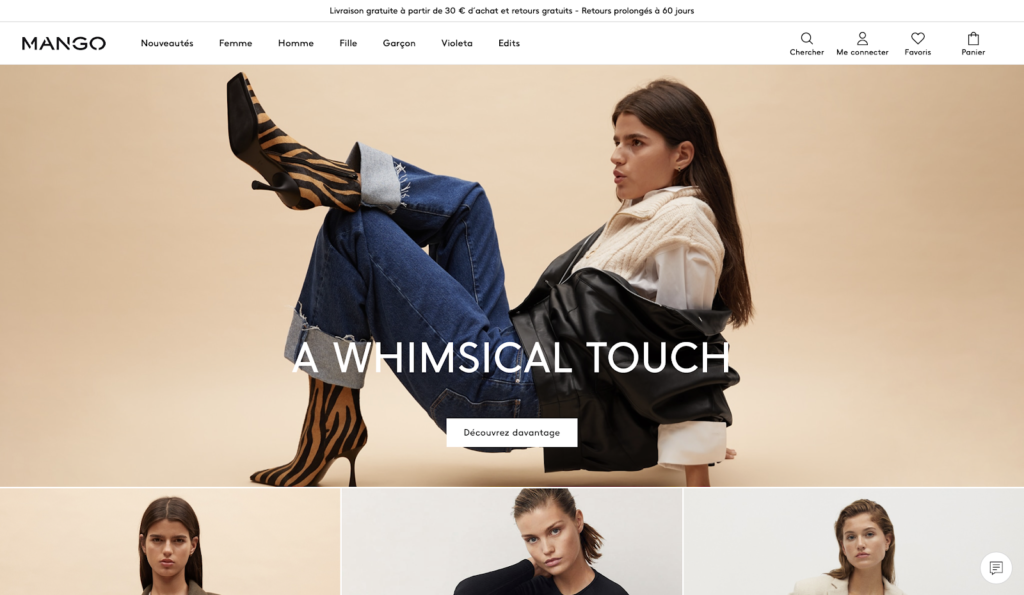
This is the case for example of Mango, who has developed a relatively simple, but satisfactory website. We know immediately where to find information.
7. FIGURES
In 2021 more than ever, we need factual data to better assimilate what is happening around us, and this is most often done through data visualization. Therefore, illustrations presenting data will be omnipresent this year. Keep in mind that numbers are very expressive, and are therefore a very good way to illustrate what is truly going on. This concept can be found of course in the medical field (spread of the virus, number of volunteers, etc.) but also on e-commerce sites (number of loyal customers, number of positive returns, etc.).
Some brands, such as Volkswagen, have already integrated it, as shown in the graphic below.
8. PRODUCT STAGING
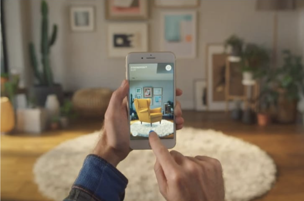
As individuals have become accustomed to searching for their products online, it is essential that they are well presented. Now more than ever is the time to stage products in a creative and digital way. It is well known that not being able to see, touch and smell products makes the act of buying more complex. So we must find a way to make our experiences as realistic as possible, on a digital medium: video, 360°, large photographs, different angles, everything is permitted as long as it highlights the product. One brand that’s been on point in this area is IKEA and augmented reality app. Thanks to this new app, it is now possible to visualize IKEA products from home: ideal for custom decorating. This is also the case for eyewear brands, which allow you to visualize glasses directly on your face by using your camera and facial recognition.
As you can see, it is important in 2021 to stage your products in such a way that the user can project themselves as much as possible.
9. EFFECTS
5 effects will be very trendy in 2021. All distinct from each other:
Abstract Arts
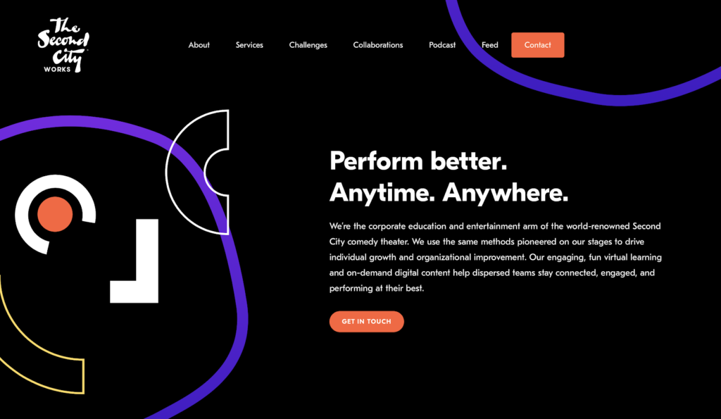
By 2021, designers are likely to use more and more abstract shapes such as squares or circles in their designs. Just like the handmade drawings we will see a little below, this initiative can be used to replace photos or illustrations. Usually, this technique brings a certain amount of movement to the web page, and also brightness.
As this example (The Second City Works) shows, pages using this technique are expressive and lively.
Scrolling
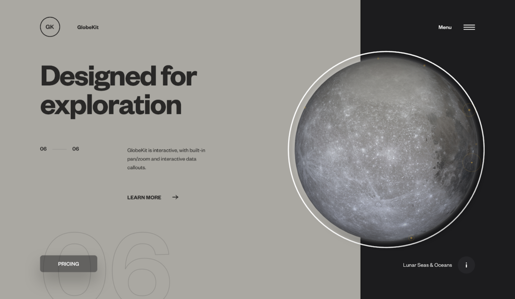
If you scroll through the GlobeKit page, you will quickly see that the sections rapidly change from one style to another, which implies a clear distinction between them. This scrolling technique allows for more interaction between the user and the website, which generates interest and satisfaction. From changing colors to changing page layout, scrolling is a very practical trend that we will see more and more in 2021.
3D and depth
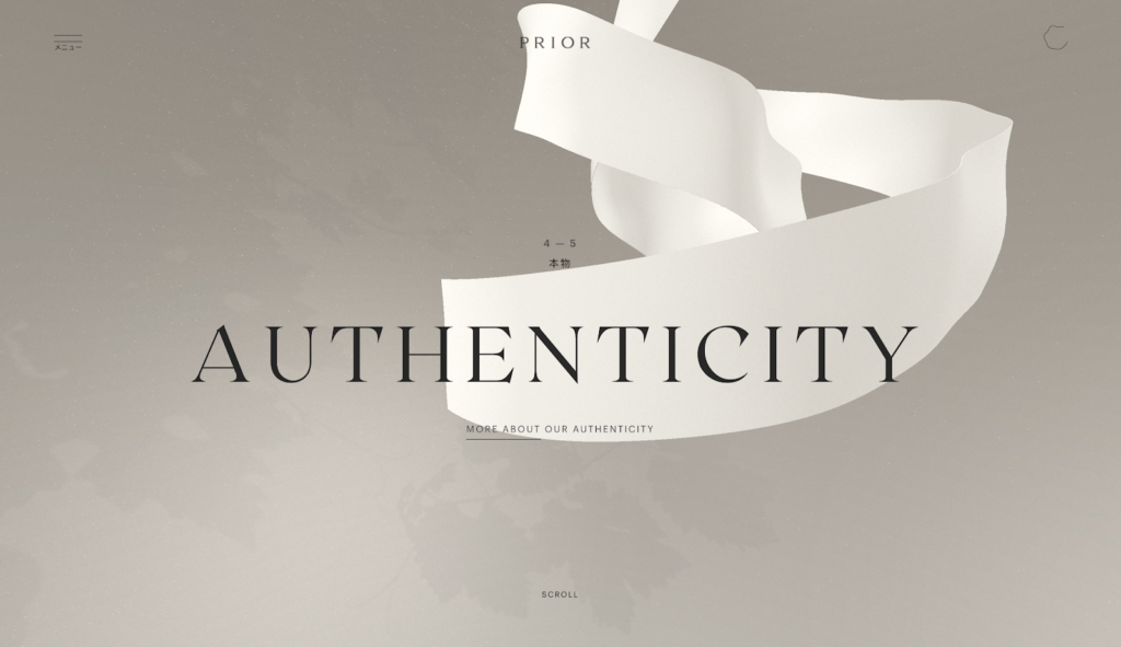
With the rise of more powerful and accessible 3D software, web designers are tending towards more 3D graphics. As a result, in 2021, websites will feature depth effects on images and typography.
Prior is a company that has understood this very well. As we (the users) change sections, we get to see a 3D staging of the graphic elements, which creates a certain immersion.
Handmade
This is surely one of the biggest trends for 2021. Making the website less formal and more natural, the handmade design is very effective. It allows you to personalize a website, and thus makes it more welcoming and inviting. It can take the form of handwritten fonts, reworked images, underlines, personal photos… just to name a few.
Asymmetry
This technique initiated in 2012 and 2013 will be widely used by web designers in 2021. It indirectly allows you to “spice up” the desired page by highlighting the most important elements. Therefore this technique, when used wisely, facilitates the perception of information, and uses space more efficiently.
CONCLUSION
Hopefully we will have seen that when it comes to web design, we will not be bored in 2021. However, where many trends emerge, others disappear. This is the case of static elements, strict geometry and traditional stock images which are to be avoided in 2021. But you can opt without any doubt for neomorphism, interaction, visual enhancement of products or the many other effects that are at your disposal.
Do you need to revamp your website this year and would like to discuss one of these trends? Contact us to talk about it.
